Ditch the Toast: Craft Your Own React Notification Popup in Just 10 Minutes!

Ditch the Toast: Craft Your Own React Notification Popup in Just 10 Minutes!
Introduction
Are you tired of fitting your unique application needs into the rigid molds of third-party notification libraries? It’s time to break free and embrace the power of customization! In this guide, we’ll demonstrate how to create a bespoke notification popup system in React. This DIY approach not only adds a personal touch to your application but also sheds the unnecessary bloat of external libraries. Let’s dive in and get your app popping with its very own notification system!

Prerequisites
- A grasp of React and JavaScript basics.
- A React project ready to go.
For this example I am using Bootstrap for basic styling. You can style however you want but the implementation will stay same.
Step 1: Create new react app
To create new react app use following commands
// If using npm
npx create-react-app projectname

// If using yarn
yarn create react-app projectname
Step 2: Setting Up the Toast
We introduce Toast a singleton class that governs the display of alerts throughout the application.
Create a file in components/Toast/toast.js and add following code.
class Toast {
  callback;

  registerCallback(cb) {
    this.callback = cb;
  }

  showToast(type, message) {
    if (this.callback) {
      this.callback({ type, message });
    }
  }

  error(message) {
    this.showToast('error', message);
  }

  info(message) {
    this.showToast('info', message);
  }

  // add more methods for success, warning as per need
}

export const toast = new Toast();- Centralized Event Handling: The
Toastclass centralizes all event handling for toast notifications in the application. - Callback Registration: The
registerCallbackmethod allows setting up a function to handle how toasts are displayed. - Toast Display Functionality: The
showToastmethod is used for actually displaying the toast, with custom message and type. - Utility Methods: Includes methods like
errorandinfoto easily display toasts in specific styles, such as for errors or informational messages.
Step 3: Crafting the ToastContainer Component
Now we have finished setting up manager class to manage our toasts, now lets setup ToastContainer that will be used to display toast throughout or app.
Create file component/Toast/toastContainer.jsx and add following code
import { useEffect, useState } from 'react';
import { toast } from '.';

import './toast.css';

const ToastContainer = () => {
  const [toastOptions, setToastOptions] = useState(null);

  useEffect(() => {
    const show = (options) => setToastOptions(options);
    toast.registerCallback(show);

    return () => toast.registerCallback(null);
  }, []);

  const handleClose = () => setToastOptions(null);

  if (!toastOptions) return null;

  const classes = getStyleClass(toastOptions.type);

  return (
    <div className={`alert customToast ${classes}`} role="alert">
      {toastOptions.message}
      <button
        type="button"
        className="btn-close"
        aria-label="Close"
        onClick={handleClose}
      ></button>
    </div>
  );
};

const getStyleClass = (type) => {
  switch (type) {
    case 'error':
      return 'alert-danger';
    case 'info':
      return 'alert-primary';
    default:
      return '';
  }
};

export default ToastContainer;ToastContaineris a functional React component that manages the display of toast notifications.- Initializes
toastOptionsstate withnull. This state will hold the options for the currently displayed toast - When component is mounted we setup
showfunction that is registered in toast. Thisshowfunction will be called whenever toast is triggered. We deregister toast callback when component is removed from App. handleCloseis a function that resetstoastOptionstonull, effectively hiding the toast.getStyleClassis a helper function that determines the CSS class based on the type of toast (e.g.,error,info).
Create css file components/Toast/toast.css for our custom style and following css style
.customToast {
  position: fixed;
  top: 10px;
  left: 50%;
  transform: translate(-50%, 0);
  display: flex;
  align-items: center;
  gap: 20px;
}
Step 4: Export required components
Now we have create out custom Toast, it’s time to export it so we can use it anywhere in the application.
Create file components/Toast/index.js and add following code.
export * from './toast';
export { default } from './toastContainer';
Step 5: Let’s use our custom toast component.
For this we’ll create two buttons in app and onClick we’ll show required component.
In App.js add following lines.
import ToastContainer, { toast } from './components/Toast';

function App() {
  const showError = () => toast.error('this is error message');
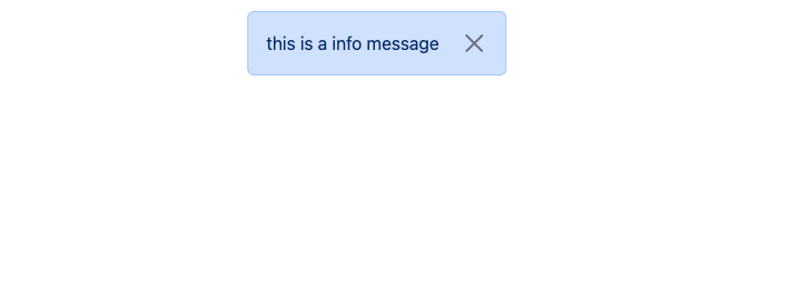
  const showInfo = () => toast.info('this is a info message');

  return (
    <>
      <button className="btn btn-primary m-2" onClick={showInfo}>
        Show info toast
      </button>{' '}
      <br />
      <button className="btn btn-danger m-2" onClick={showError}>
        Show error toast
      </button>
      <ToastContainer />
    </>
  );
}

export default App;
Here as you can see we have two button and two functions, showError and showInfo, are defined for triggering error and info toasts, respectively. They use the toast.error and toast.info methods with custom messages.
Component ToastContainer works as placeholder which is used to show toast notification.
Conclusion
In this guide, you’ve learned several key points about building and utilizing a custom toast notification system in React:
- Creating Your Own Toast: I’ve walked through how to create a custom
Toastclass and aToastContainercomponent. This approach allows you to have complete control over the styling and behavior of your toast notifications, tailored specifically to your application's needs. - Trigger Toast from Anywhere: The flexibility of this system is evident in its ability to trigger toast notifications from anywhere in your application, even from plain JavaScript files where there are no React components. This is made possible through the
toastinstance, which can be imported and used to display toasts regardless of the component structure. - No External Dependencies: This custom solution does not rely on any external dependencies. It’s a lightweight and efficient way to implement toast notifications, ensuring that your application is not burdened with additional libraries or packages. This aspect is particularly beneficial for maintaining a clean and optimized codebase.
Congratulations! You’ve just built a lean, efficient, and customizable notification system for your React application. This setup provides a great foundation that can be enhanced with additional features like animations, various alert styles, and more.
If you prefer video guide then https://youtu.be/LTrIX4TcJ5M watch it here.